LITNUM

LITNUM

2026

BRAND & APP DESIGN

FIGMa,PHOTOSHOP,illustrator

2026

BRAND & APP DESIGN

FIGMa,PHOTOSHOP,illustrator

2026

BRAND & APP DESIGN

FIGMa,PHOTOSHOP,illustrator

YEAr

ROLE

TOOL

YEAr

ROLE

TOOL

YEAr

ROLE

TOOL

Project Overview

Litnum is redefining the remittance space by leveraging cutting-edge technology and stablecoins to ensure fast, affordable, and secure transactions. Focused on empowering individuals and businesses, Litnum aims to illuminate the path to seamless cross-border payments, starting with Canada and Nigeria and eventually expanding globally.

The Challenge

Understanding the Vision

and Challenges

To bring Litnum’s vision to life, we crafted a comprehensive brand identity and a user-centric platform. Our approach was not just about design; it involved deep market research and strategy to ensure that Litnum effectively addresses the needs of its users. We developed a platform that leverages stablecoins to reduce costs and increase speed, ensuring a seamless user experience from MVP to full launch.

The Problem and Business Strategy

In order to position Litnum effectively, we conducted thorough market research to understand the unique challenges and opportunities in the remittance space.This involved analyzing the competitive landscape, identifying key user needs, and developing a strategic roadmap that sets Litnum apart from traditional remittance methods.

In order to position Litnum effectively, we conducted thorough market research to understand the unique challenges and opportunities in the remittance space.This involved analyzing the competitive landscape, identifying key user needs, and developing a strategic roadmap that sets Litnum apart from traditional remittance methods.

Brand Identity

The Litnum logo embodies the brand’s essence with a sun-inspired icon, symbolizing enlightenment and trust. The color palette of black and gold reflects sophistication and reliability, with sun rays breaking through the darkness, symbolizing hope and clarity.

The Litnum logo embodies the brand’s essence with a sun-inspired icon, symbolizing enlightenment and trust. The color palette of black and gold reflects sophistication and reliability, with sun rays breaking through the darkness, symbolizing hope and clarity.

Brand Application

Our visual language incorporates 3D glass illustrations, such as clear glass coins and pipes, symbolizing transparency and fluidity. The glassmorphism effect on the interface, with black backgrounds and gold accents, creates a modern, elegant look that’s both intuitive and visually appealing.

Our visual language incorporates 3D glass illustrations, such as clear glass coins and pipes, symbolizing transparency and fluidity. The glassmorphism effect on the interface, with black backgrounds and gold accents, creates a modern, elegant look that’s both intuitive and visually appealing.

Product Application

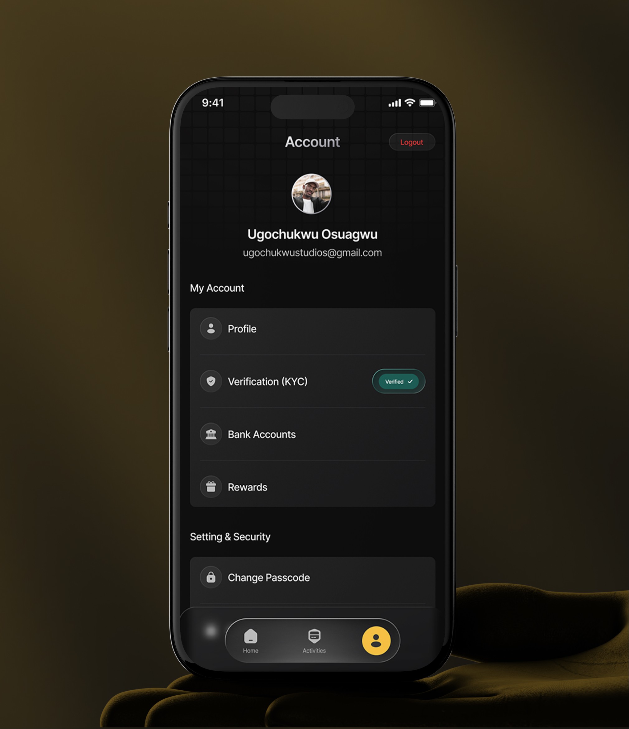
The visual language incorporates 3D glass illustrations, such as clear glass coins and pipes, symbolizing transparency and fluidity. The glassmorphism effect on the interface, with black backgrounds and gold accents, creates a modern, elegant look that’s both intuitive and visually appealing.

The visual language incorporates 3D glass illustrations, such as clear glass coins and pipes, symbolizing transparency and fluidity. The glassmorphism effect on the interface, with black backgrounds and gold accents, creates a modern, elegant look that’s both intuitive and visually appealing.

Create a free website with Framer, the website builder loved by startups, designers and agencies.